PLEASE NOTE (7/7/2023): Thank you for your interest in this blog article. It was written by a former staff member as part of a personal interest in the topic, and there are no plans to continue research or update this topic. Our current staff will not be able to assist with questions about this content, and it only remains online as a general resource.

When I published my first post on Avoiding Migraines Resulting From Changes In Barometric Pressure in 2013, I had no idea how many fellow migraineurs would read, engage, and comment.
“Hi guys, OK so this really does work. I suffered when I lived in Virginia. Moved to Georgia, no headaches, moved back to Virginia, headaches, moved to Delaware, suffered horribly. The worst ever! Found this article, moved back to Georgia, no headaches. I’m so serious, I can live now.” – Kyle
I have been touched by the gratitude shown by many of the readers, and inspired that I have been able to help others–if not with their migraines directly, then at least with a better understanding of one apparently common migraine trigger. Many were happy to see some useful data that could help them understand the barometric pressure characteristics of places where they lived or were considering moving to. Others asked me where I got my data, some wanted to see hourly variation, and many others wanted to see global variation data.
Could u be kind & send me a list of the best worst places to live in Western Europe. I am hoping your list will identify the best place to live in UK I suspect all of the UK will be bad but I am stuck until I can retire & cant move to Spain or Malta until then…Thank u God for guiding me to this site. – Harry
For those who wanted more, this post is for you.
(The Usual Disclaimer: I’m not a doctor, and am in no way qualified to give medical advice. I organized this data for myself and for the benefit of those who believe that living in a place with less barometric variation could be good for their health, so that they could see which cities have more or less barometric variation.)
Where I Got My Data
Although the original data set I used to compile my original U.S. list does not seem to be online any longer, I was able to find a global dataset at the FTP site in the National Climactic Data Center (NCDC) public area of the National Oceanic and Atmospheric Administration (NOAA), which contains barometric pressure readings for more than 11,700 weather stations around the world. Downloading all data from 2008 through March of 2016, I constructed a database of over 322 million barometric measurements, many of them taken at intervals as short as 15 minutes. The database size weighs in at just under 10 gigabytes. There’s so much data, in fact, that my first task was to take a sample to see if hourly or every-15-minute data would prove to be more useful than 24 hour data. If I could research global barometric variation using the daily data set, it would really save on computing resources and allow me to publish results much more quickly.
Hourly Variation
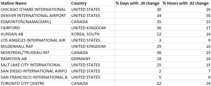
I chose 13 weather stations distributed through the world which were in larger population centers (as opposed to weather rafts or remote air force bases), and which had hourly pressure data available since 2008–there were only 476 of these to choose from, the vast majority of them in the U.S. (320) or Canada (129). I then compared the percentage of days per year that experienced my standard migraine-inducing daily variation threshold (a .20 or greater change between 24 hour measurements) with a new hourly variation threshold: a .02 or greater change between any two hourly measurements). I selected the .02 hourly threshold because, like a .20 pressure change over a 24 hour period, a .02 pressure change in an hour occurs at approximately a 20% rate throughout the data set.
Here are the data on hourly variation:
Here are those data plotted for correlation:
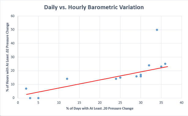
Other than the outlier–Denver (which as a high altitude city can expect to have greater measurement error, greater true variation, or both)–it seems reasonable to conclude that daily barometric variation is an excellent proxy for understanding hourly barometric variation.
Global Variation Data
Using daily changes, I was able to construct both a master list and several maps showing the annual barometric pressure variation of the world cities.
Let’s show the maps first, because they reveal some rather amazing patterns regarding barometric pressure variation.
Note: If you want to see the maps in full screen mode, you can click on them to get a full screen slideshow. You can also right-click and then open each image in a new tab, and if you do this, on the new tab you can zoom the browser in to closely examine the a region of interest.
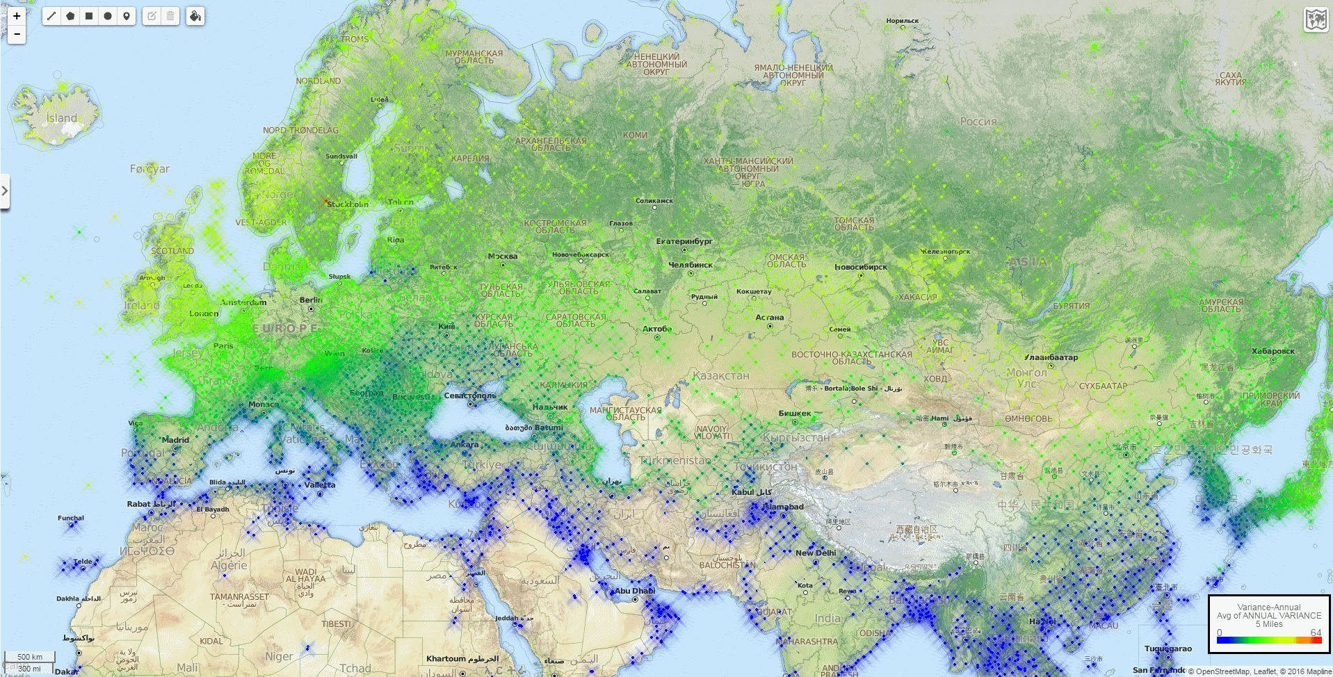
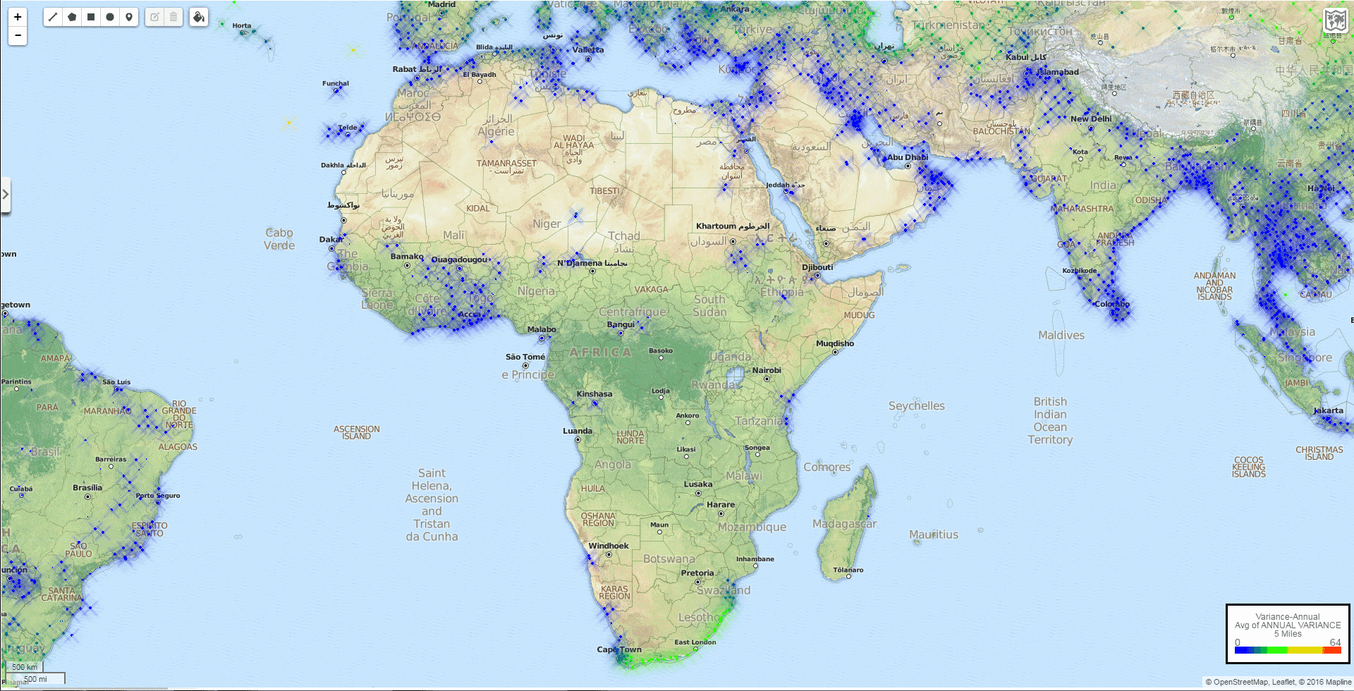
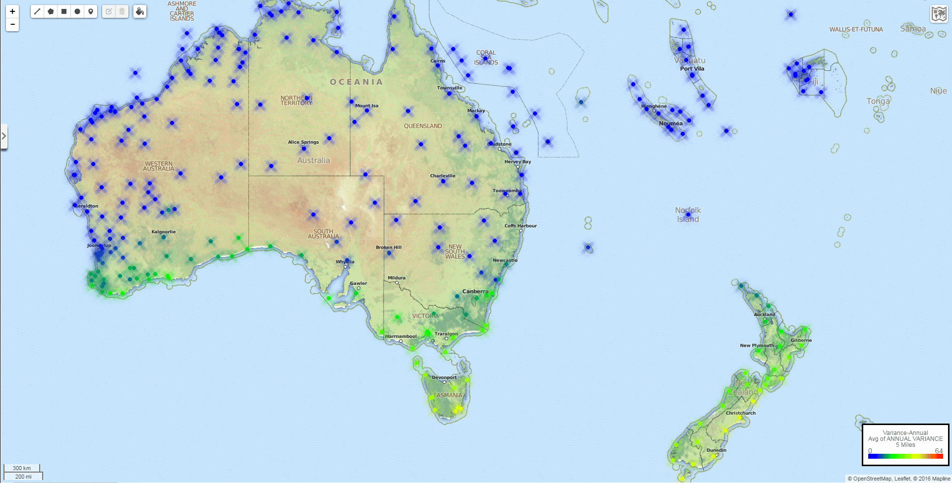
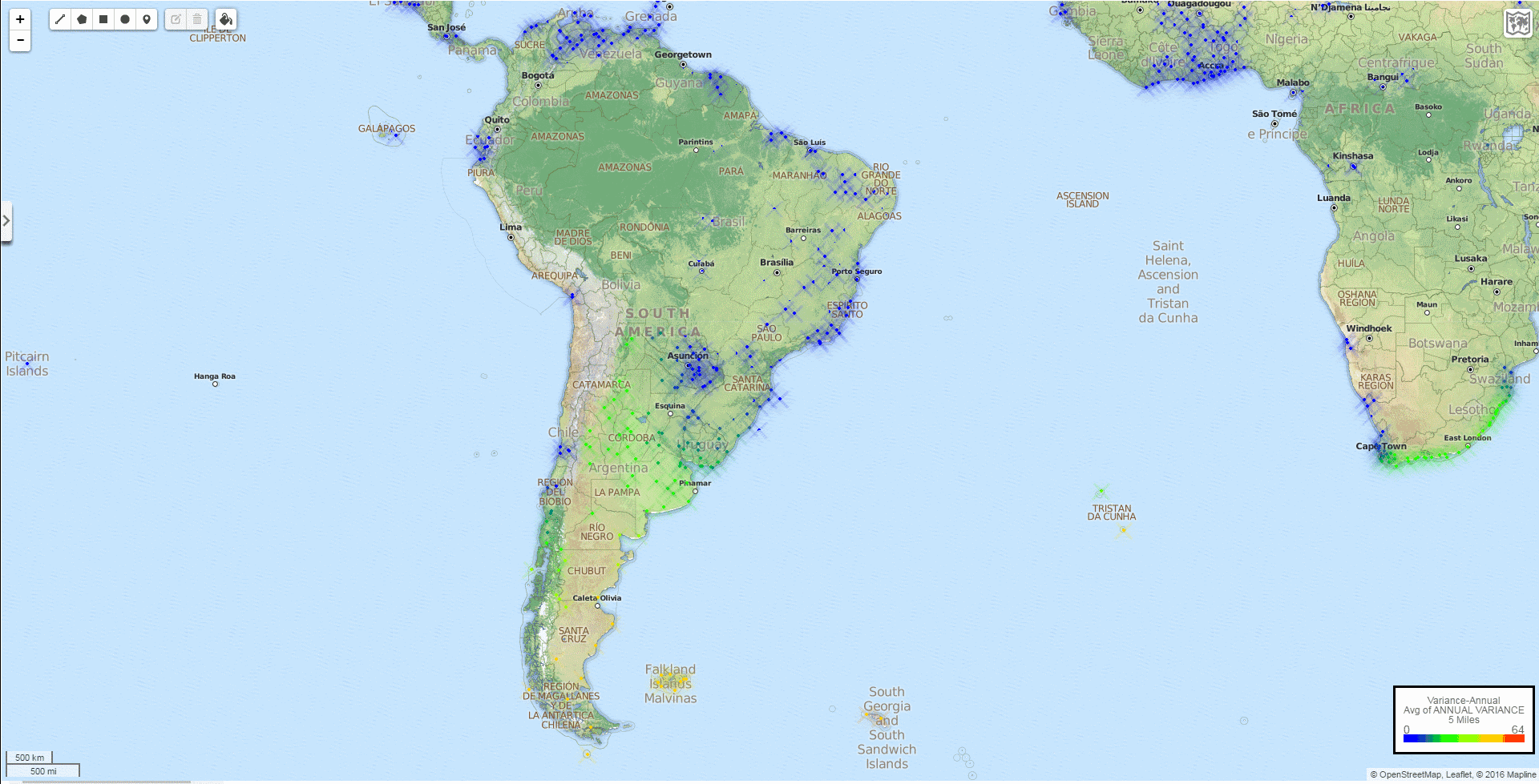
The World
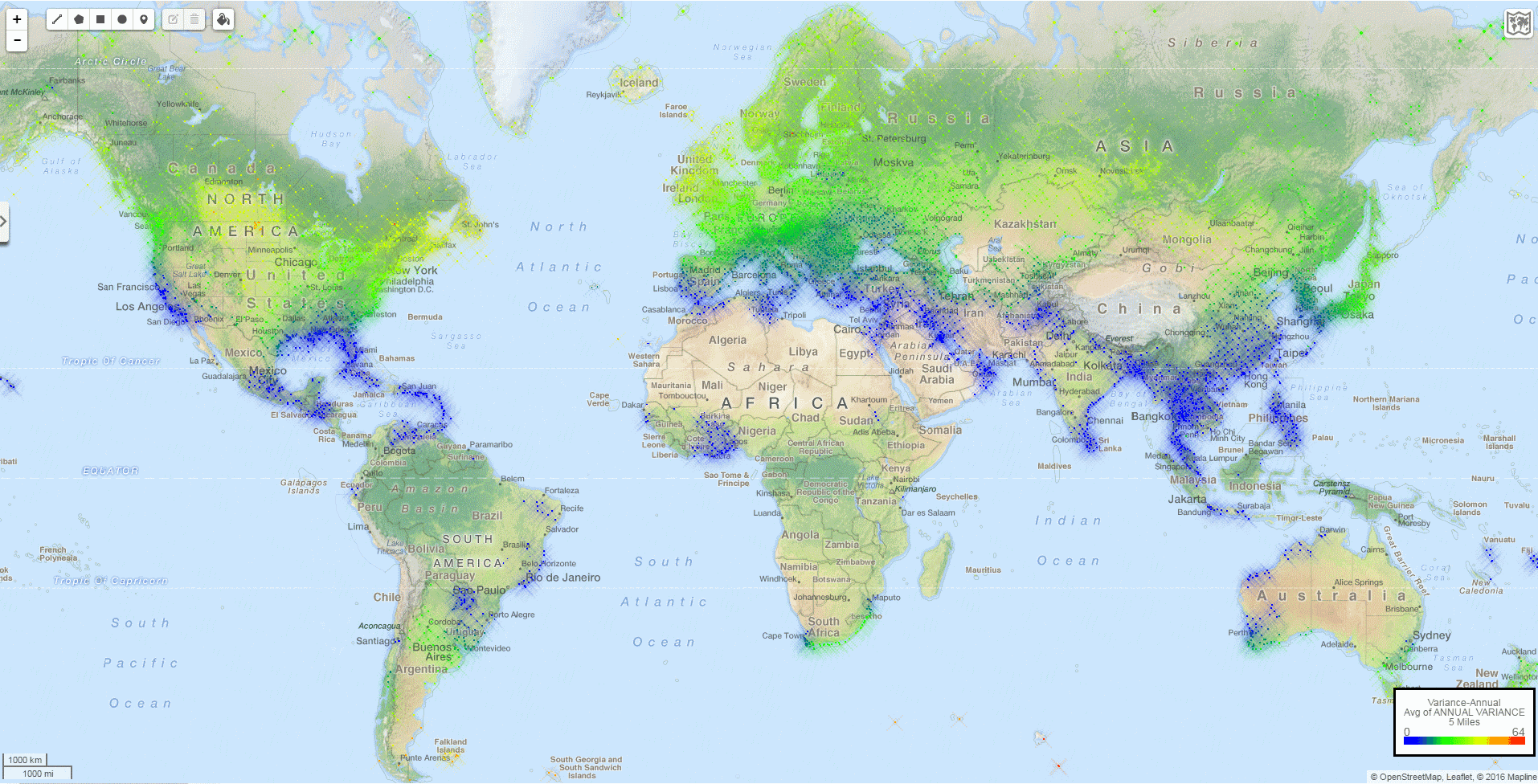
First, you can see that there’s not much red (more than 50% of days reaching the .20 threshold variation is quite rare on this planet), so for the most part, blue means very few days of high pressure variation, green means more days of high variation, and yellowish colors mean a lot of days of high barometric pressure variation. For my migraine patterns, I would live anywhere that is colored dark blue without a moment’s hesitation, and I would not want to live anywhere green and certainly not anywhere yellow. (Anecdotally, my migraines have been at their worst the times I have lived on the U.S. East Coast, and at their best when I have lived in California).
Second, you can see that these variations are almost perfectly related to latitude, with practically zero variation in the tropics, and latitudes in the Northern Hemisphere generally showing lower variation than counterpart latitudes in the Southern Hemisphere. There are some interesting exceptions:
- Coastal California, Portugal, Italy, and the Balkans seem to have considerably smaller pressure variation than would be expected from their latitudes. So these are likely better than expected places to live for migraineurs.
- The United States East Coast has high variation relative to its latitude.
- The United States Mountain Time Zone has very high variation relative to its latitude.
Next, you can review eight detailed zoom-ins on the global map.
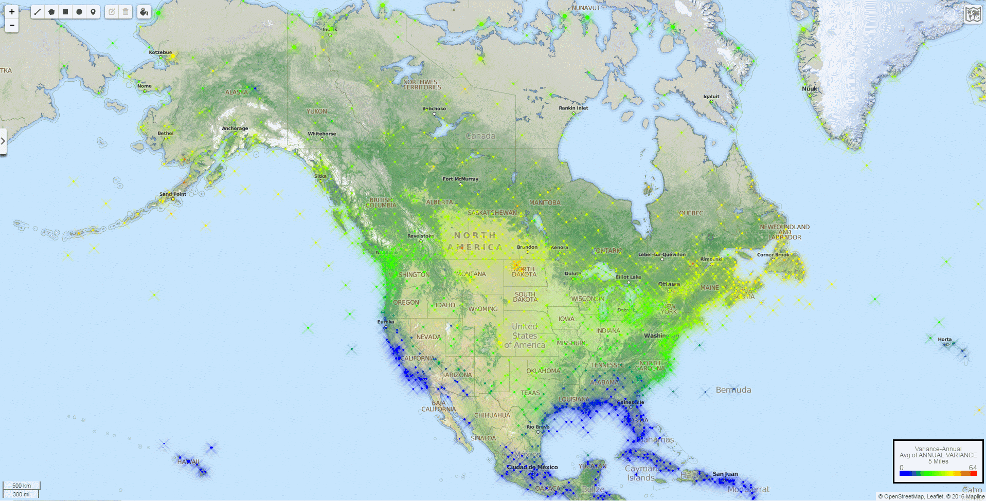
North America
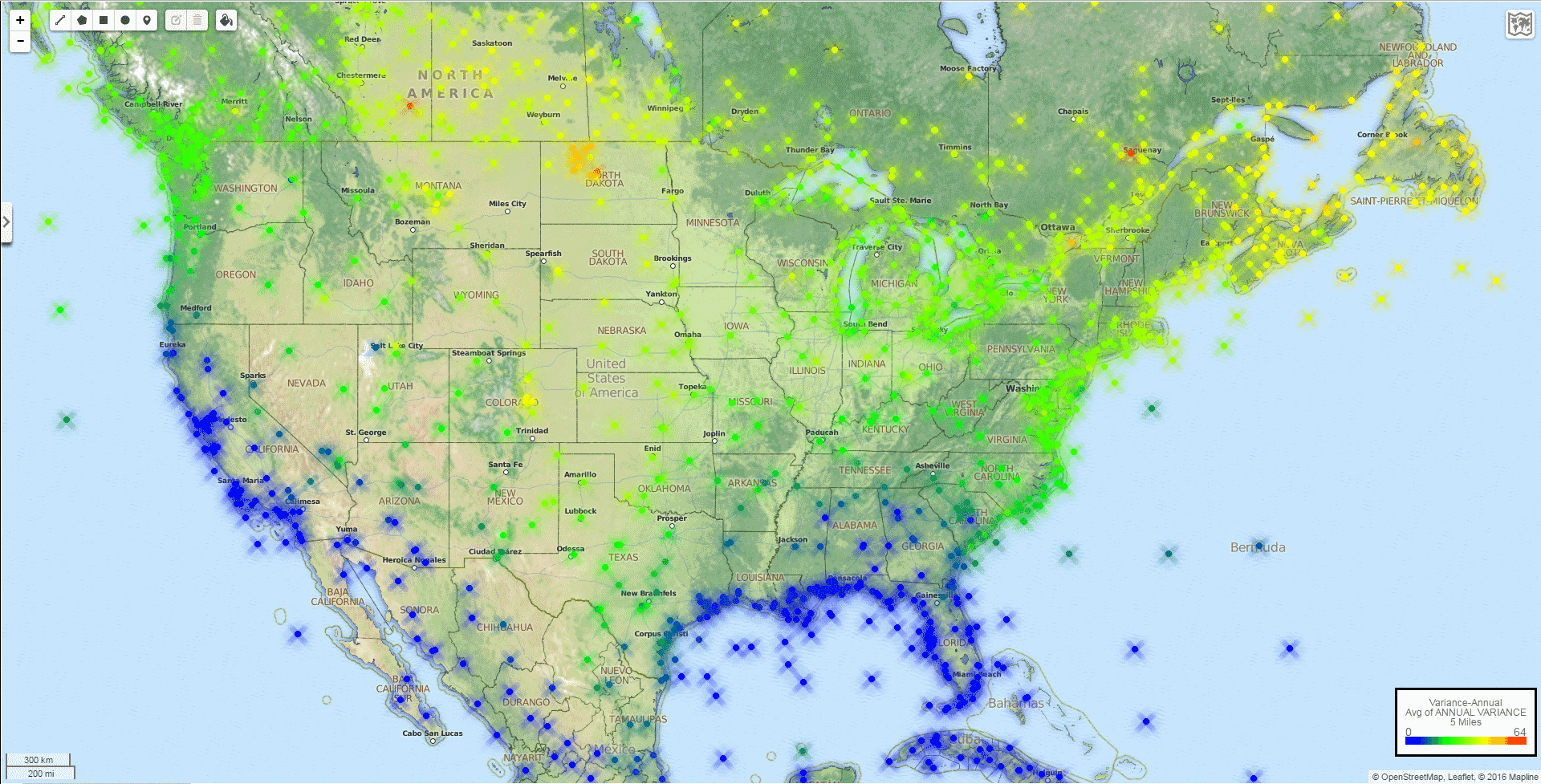
The further south, the better, except for California, which is all blue. It is worth pointing out that there is a material difference between Crescent City, in extreme Northern California (12% of days annually cross the .20 threshold) and San Diego (1% of days), just not enough to change the colors on this particular map. (Interested viewers can download the raw data spreadsheet at the bottom of this document for more details.) Also of note, some of the highest barometric variation in the world occurs in North Dakota for some reason.
Eurasia and North Africa
Europe and North Africa follow latitudes pretty closely, with the biggest surprises in the United Kingdom and Japan. Ireland has much higher barometric variation than expected for its latitude. The East Coast of Central Japan has shockingly high variation given that it’s on the same latitude as places with almost no barometric variation like Tel Aviv, Lisbon, and Islamabad. Norway also seems to be a bit worse than comparable latitudes in Sweden or Finland.
Africa and South Asia
Ah, tropical living! Except for the unexpected swath of pressure variation in Coastal South Africa, living anywhere on this map would have you pretty safe from pressure-induced migraines.
Oceania
Oceania follows latitude predictions as expected. Sydney has low variation, Melbourne is moderate, and New Zealand can get extreme on its wild southern end. I have no idea why Sydney and Melbourne don’t show up on this mapping software, where instead we see Newcastle and Traralgon.
South America
Very high and narrow mountain ranges such as the Sierras and Andes seem to throw off latitude correlation. In South America, there is a line of exceptionally high variation on the Eastern edge of the Andes. This is similar to the line of exceptionally low variation on the Western edge of the Sierras in North America.
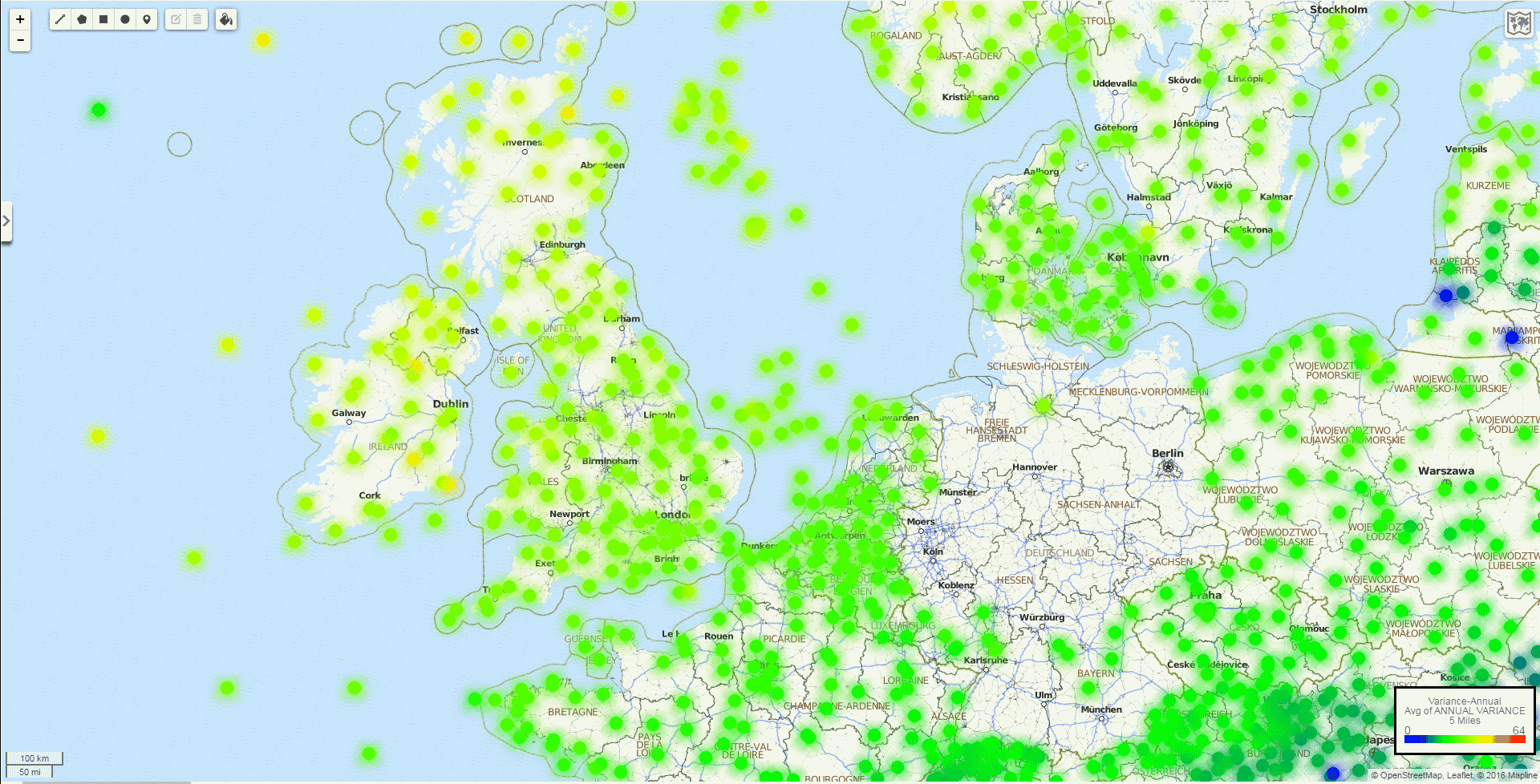
Western Europe
In Western Europe, there are very few measurements available in Germany for some reason. As mentioned earlier, Ireland and Scotland have shockingly high pressure variation, presumably related to the legendary wind and rainfall in those areas. (In addition to not be a medical doctor, I’m also not a meteorologist. I’m just a guy who gets a lot of migraines when the barometric pressure changes, and I’m happy to know that I shouldn’t ever visit Ireland in January.) I don’t understand the blue dots in the area of Northern Poland and Lithuania, but maybe migraineurs there are getting a little bit of a break. Or maybe there’s some measurement error there.
United States
I’ve written a lot about the United States in prior articles, so I just leave it at wondering this: why does central North Dakota have the highest barometric pressure variation on the planet? If you go about 500 miles due east or west, you get to Duluth/Superior or Missoula, where there’s still a decent amount of pressure variation, but nothing like the worst variation on Earth. Denver is also much, much worse than you would expect. Another case of being on the Eastern edge of a large mountain range? Or perhaps more measurement error?
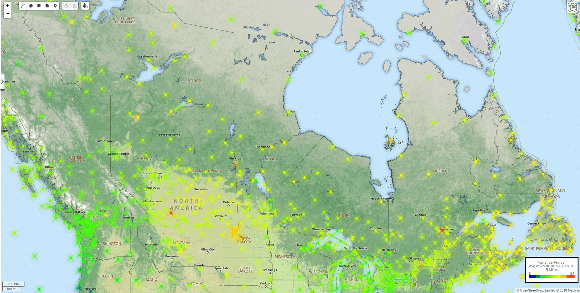
Canada
Canada is really not a good place for migraine sufferers who are triggered by changes in barometric pressure. The best major cities in Canada seem to be Vancouver, Toronto, and Montreal, so at least that covers a reasonable percentage of the Canadian population. Flin Flon, Manitoba seems particularly bad. Yes, I just wanted to write the words “Flin Flon, Manitoba”.
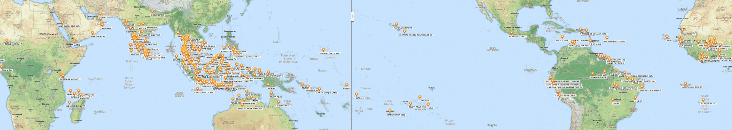
Zero Days of .20 Variation Over 2,000 or More Measurements
For those of you who would like to visit a place that has not experienced a single day of .20+ variation since 2008, and for which we have at least 2,000 recorded pressure measurements since that time, there happen to be 245 such places on this planet. Note that many places between the tropics have certainly had zero days of .20+ variation since 2008, but do not appear on this map because we don’t have 2,000 measurements for those places. This would likely be the case with much of Africa. To get a good look at this map, you can right-click on the map and select “Open image in new tab”, and then zoom in on the image.
The Raw Data
Saving the best for last, perhaps, feel free to download this Global-Barometric-Pressure-Threshold-Variation Excel spreadsheet. It contains the threshold variation percentage for every weather station with at least 50 daily change measurements since 2008, and the spreadsheet tabs provide both annual and month-by-month data. The spreadsheet is 3.5 MB is size, and so might take a little while to download on slower internet connections.
So, for example, if you live in Cape Town, South Africa, you could go to the Annual tab of the spreadsheet, use Control-F to search for “CAPE TOWN”, and see that at the Cape Town International Airport (CAPE TOWN INTL) has 14% of its days throughout the year (51 days) experience a barometric pressure variation of .20 or higher. If .20 pressure variation triggers a migraine headache every time, then a migraineur who lives in Cape Town could expect at least 51 migraines per year while living there. If you want to see whether this varies by season, which it does in every place that I’ve examined, you could go to the January tab, use Control-F to search for “CAPE TOWN”, and see that only 4% of days in January (perhaps one day each January) experience threshold variation. So the summer in Cape Town, as with most places, is a time of much lower barometric pressure variation. Looking at the winter in South Africa, in July, shows that 23% of days in July (an average of 7 days each July) experience threshold variation in Cape Town, which would be problematic for a migraine sufferer with a barometric pressure variation trigger.
This spreadsheet is the best way to see the month-by-month variation for the weather station closest to where you live.